
 |
| Backstamp, Courtesy RetroChalet. |
While Residential and Home Decorators melmac lines were still on the market, Russel Wright began production of a new "translucent" (see through) melamine line called "Flair." This line design in the melamine version would be heavier, fancier, and more elegant than past designs. It would mimic some of his very own ceramic shapes such as the "Highlight" dinnerware line he designed for Justin Tharaud (See it here) and would prove to be just as lovely, only in plastic form.
Flair by Northern (designed by Wright) officially "hit the market" in 1959, although it was short lived due to the economic problems Northern would face in 1960. By 1962 Northern was defunct, having overextended themselves acquiring Watertown's dinnerware division on credit on top of other issues (*For a Full History of Russel Wright and Northern's relationship, read this page.)
Originally Wright had been contracted to work with Northern to produce two new patterns per year in the Flair line. In Syrcause I did extensive research on the subject locking myself into the Wrigh files for a week. I found many gorgeous patterns that he submitted to Northern of which they did not approve of. So the designs you see below are the only ones that the Sales Management team and Wright actually put into production. Some were produced over the course of years and some perhaps only a few months. If you find any other designs than the ones listed here please contact me, as I have no doubt that test plates are in existance--in fact I have a few myself.
Ming Lace
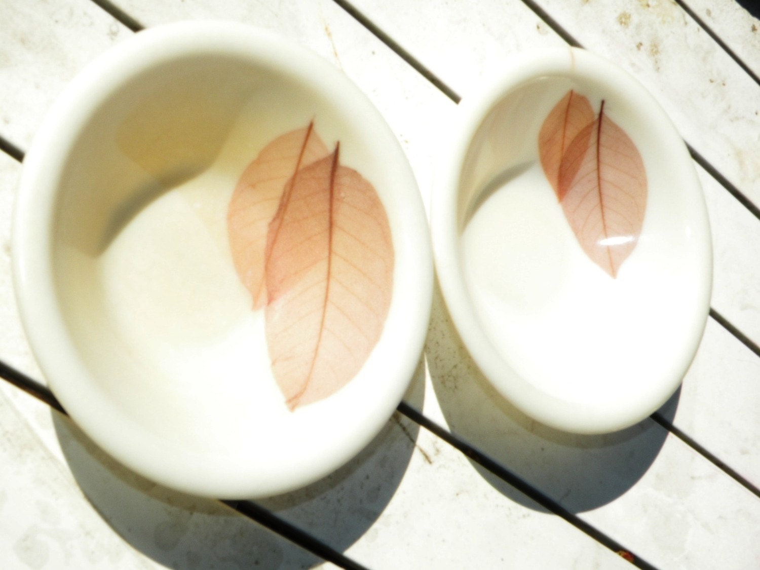
The most popular pattern and easiest to find is the "Ming Lace" as shown above. This used real imported Ming Tree leaves from the Jade Orchid tree which were imported from China. Wright worked with the factory indicating how he wanted the placement of the leaves in each piece. Although each leaf is different the overall placement remains important in each cup, so that a whole set of cups would look uniformly patterned.
 |
| Gregory Zimmer, author of Melmac Dinnerware Book, shows the "translucency" of the Ming Lace Flair Melmac. |
In Syracuse, I found Wright's notes on the leaf distributor, and was very particular in the placement and how many leaves per dish. Just like most lines, Wright would make sure the design would differ piece to piece to keep it all in good taste.
The cup and the plate placement designs would differ. It's safe to say he was perhaps "first to embed" items in the melamine. (I'm not certain if those tacky fiberglass trays with real butterflies in them may have inspired him, or followed in hot pursuit. )
Ming Lace came in two lovely variations:
- Brown w/green tan leaves.
- Green-yellow leaves.
 |
| Shipping boxes: From Factory to Customer, or sometimes to store. Credit: Ira Mency. |
I have found that over time something strange happens to Ming Lace as far as wear goes. It appears that on some plates, bowls and cups after much wear and use, a brown blob will appear in the dishes themselves and pardon me for sounding crazy, seems like the layer in which they placed the leaves. Look at the bowl on the left to see if you see what I mean. It is not a stain but something visible in the plastic itself. I have seen this many times over the years, and it doesn't come off. It's almost as if they put a melamine foil down into the plate to keep the laves in place, and if you wear the bowl out enough, you are left with the melamine foil stained up and butt ugly. Yucky!

Arabesque
A lovely pattern of swirled designs. This reminds me somewhat of a spirograph and of Wright's SOLAR designs in pottery!
Arabesque was produced in:
Instead of being entirely translucent, it was made with solid colored accompaniments such as using the blue cups for the blue and gold version and solid cream or white cups for the other versions. I am unsure if this was Wright-approved or something the factory felt would sell better. They seemed to do a lot of what they wanted! Oddly, I've found some sets in complete solid white instead of the translucent melmac so your guess is as good as mine. The cups, cereal bowls, and other pieces were made in turquoise blue, or solid white to match the main pieces.
 |
| Original Brochure shows how lovely Flair looks on the table, courtesy, Ira Mency. |
 |
| Green variation of Ming Lace, courtesy RetroChalet. |
 |
| Cup with Embedded leaves makes for lovely design. |
Arabesque
A lovely pattern of swirled designs. This reminds me somewhat of a spirograph and of Wright's SOLAR designs in pottery!
Arabesque was produced in:
- A blue/gold variation on translucent melmac
- A blue/gold variation on solid white melmac
- A gold/gold variation on translucent melmac
- A gold/gold variation on solid white melmac
Instead of being entirely translucent, it was made with solid colored accompaniments such as using the blue cups for the blue and gold version and solid cream or white cups for the other versions. I am unsure if this was Wright-approved or something the factory felt would sell better. They seemed to do a lot of what they wanted! Oddly, I've found some sets in complete solid white instead of the translucent melmac so your guess is as good as mine. The cups, cereal bowls, and other pieces were made in turquoise blue, or solid white to match the main pieces.
 |
| Bread Plates offered by Prairie Dec Arts Etsy shop in classic blue/gold on eggshell. |
 | |
| Arabesque Blue / Gold on Translucent Dishes. Solid Turquoise Accompaniments. |
 |
| Gold on Gold Arabesque but on solid white instead of translucent melmac. |
Golden Bouquet
Golden Bouquet Flair was produced :
If you ask me, it is somewhat reminiscent of Wright's Queen Anne's Lace pattern on Knowles China and Ceramic if you think about it. I do not think it was extremely popular, overshadowed by the other patterns.
Golden Bouquet Flair was produced :
- With white flowers and golden springs on translucent melmac
If you ask me, it is somewhat reminiscent of Wright's Queen Anne's Lace pattern on Knowles China and Ceramic if you think about it. I do not think it was extremely popular, overshadowed by the other patterns.
 |
| Baby's Breath. |

 |
| Flair Golden Bouquet, upper right, photo from the SFO Museum exhibit, read details here. |
Nasturtium
Nasturium was produced:
- On translucenet melmac with orange accompaniments
- In total translucency
A lovely orange flower with and green leaf design on translucent melamine with bright orange accompaniments was a big hit when shown on a table and with collectors. The orange moves melmac right into the 1960's and is vibrant, unlike the more muted patterns of Golden Bouquet and Woodland Rose. The odd part is I see it with orange solid completer pieces, or sometimes all translucent pieces. I suppose this was a how-you-want it type thing.
 |
| Photos Courtesy of Gary Maurer. |
 |
| Special Thanks to Gary Maurer for sharing his photos. |
Oddly I've seen the cereal bowl in solid orange also, but Gary has seemed to have the best of both words having half and half sugar bowl with a very cool translucent lid!
Spring Garden
Spring Garden has been produced:
Spring Garden has been produced:
- With tiny pink flowers on translucent melmac w/ solid light pink accompaniments
- With tiny blue flowers on translucent melmac w. solid light blue accompaniments
 |
| Spring Garden in Blue, courtesy Ira Mency. |
 |
| Pink Variation of Spring Garden. |
Cosmos
Cosmos was produed:
Ironically since this set mixed the pink and blue in the dish, you could choose whether to use turquoise or pink completer pieces as either would go lovely with this design.
Cosmos was produed:
- On translucent melmac showing cornflowers in blue and pink
Ironically since this set mixed the pink and blue in the dish, you could choose whether to use turquoise or pink completer pieces as either would go lovely with this design.
 |
| Courtesy: Author |
Woodland Rose

Elusive at best, a muted rose design. I've only found one piece, which is now in the hands of my fellow collector Dennis Teepe. It almost looks as if it's airbrushed. Although what I consider very rare, maybe not Wright's best work. You can read more about this pattern HERE on my Woodland Rose Page. If you want to sell any pieces, please contact me!

Elusive at best, a muted rose design. I've only found one piece, which is now in the hands of my fellow collector Dennis Teepe. It almost looks as if it's airbrushed. Although what I consider very rare, maybe not Wright's best work. You can read more about this pattern HERE on my Woodland Rose Page. If you want to sell any pieces, please contact me!
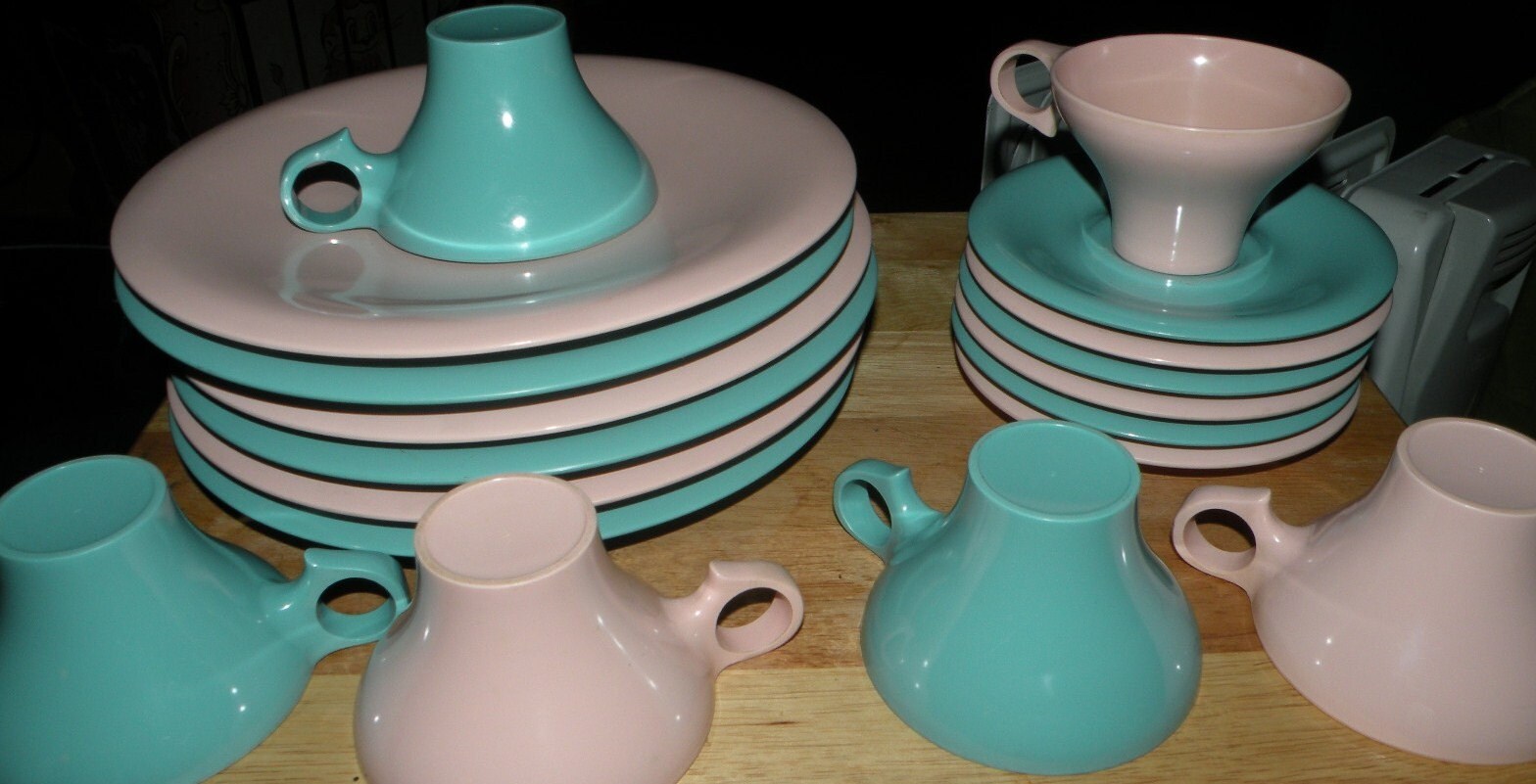
Solids Galore
Solids were produced:
- In Solid Turquoise
- In Solid Pink
- In Solid White
 |
| Solid Pink Flair. |
Is anyone wondering why the whole point of Flair Translucent was translucency but solids were being made? Hello???? Anyone home?
Translucent Solids
See thru translucent solids were produced:
- In Solid Cream
- In See Though Pink
YOU MAY WITH TO READ THIS RELATED READING ABOUT FLAIR:
Value & Rarity Guide (coming soon)
General Value Guide
How to Clean Your Melmac Dishes
You may also enjoy reading my page on:

This site is kept free thanks to my sponsors. Make sure to visit them!
This page sponsored by:
