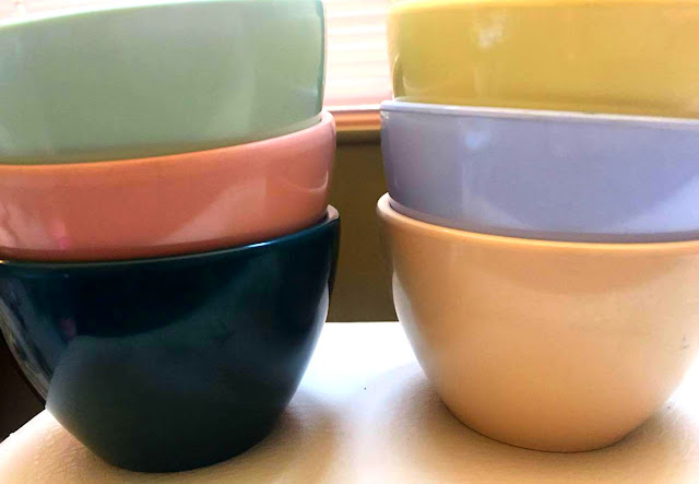
Lapcor and General American Meladur Custard Cups
Recently I acquired a very rare set of Melmac Color chips. These most likely came on a ring and were shown to customers to choose common colors for their melmac. Here is the set of 50. I love them so much!
There are 50 chips most likely color samples of popular blends on keyrings back in the day.
I spoke with fellow Plastics Researcher Christopher McPherson who runs the awesome Plastic Living website, who suggested I try to date the chips based on the color matching. So , I pulled out some of my melmac (which now lays boxed up thanks to a multi-state move) and found these custard Cups.
Meladur Color Cups , Color Matching
More on Meladur Custard Cups
First let me indicate the custard cups are hard to find, and I have collected some with backstamps of General American circa 40's and later Lapcor. They are the line of Meladur, first created by Russel Wright for General American under the GATX Meladur Russel Wright label. However, I can never prove or disprove they were or weren't a Wright design. I saw some similar indication in Syracuse that may indicate this custard cup was thought of by Wright, yet the feet were designed differently. It is my opinion the item was in the works but in the middle of contractual disputes and non-renewal, so the company nixed the feet and produced it anyhow.
1940's Blue Color is a Perfect Match to early 1940s Meladur color!
Not one I have NEVER found any signed Russel Wright and I feel they are an after-Wright creation. Why? The feet are not ribbed as his were. He created feet that were ridged for easier drying and stacking, which the design of the feet was later dropped when the line was sold without his name (after contract). After GATX finished contractual disputes, they sold the entire line with molds to Lapcor who continued to produce the line in many colors, some vibrant and lovely.
Nevertheless, I have collected them as a go-with and shown above are three original Russel Wright colors. As you can see, two of the three match the color samples perfectly. The blue tends to be melmac sample "BB171" and the pale yellow matches exact yet the code is scrubbed off and I will never know but appears to say "XX 103", of course the XX being letters I cannot make out . The tan, or almond color is a hue off.
The tan sample matches close but not perfectly.
So now I pull other colors to see if I can match. Here's what I end up with. The tan above does not match exactly and is one slight hue off. However, with only a 50 chip keyring is it not possible that other colors existed on a master keyring full of hundreds of chips?
The dark green common on Meladur and Boonton does not match exactly but appears to be a hue off all the samples, black being shown in the center.
My research notes in Syracuse indicate Wright's Meladur colors, he tried many and even put some pieces in the oven to see when they burnt and at what temperature, believe it or not. Many color codes he copied down and tried to make custom colors.
(((However, some of the same colors on Meladur (dark green and also an earlier maroon) are also common on Early Bootonware. Surely discontinued due to major scratching visibility. )))
See all the greens, n a ring of 50 it's hard to find an exact match.
In conclusion, I cannot for certain date my color sample ring yet can say that it matches the early blue and yellow perfectly. These blues and yellows originally debuted in the 1940's on Meladur, Boonton and many other dishes.
MY GUESS: 1950-1953
If I had to fathom a guess, based on my research, I would give it 1950-1956 possibly learning towards 1950-1953. I would deduce this suggestion based on the fact that a) it's a 50 chip ring and not all samples wer included in the ring, because of lack of customer interest. Thereby elimination of the dark green and maroons (color scratching), and tan on it's way out (feedback circa 1946-1949). Although this could certainly be a 1940s basic starter ring missing some colors, I would guess by the looks of the pretty vibrant blues and yellows shown above, that the colors are circa 1950-1953, keeping some of the popular older colors but adding some new for the uptown housewife.
What do you think? Leave a comment +Cindy Fahnestock-Schafer or tweet me twitter.com/iramency
Like it? Share it....


Interesting research!
ReplyDelete